Category: Inspiration

The Curie Cure

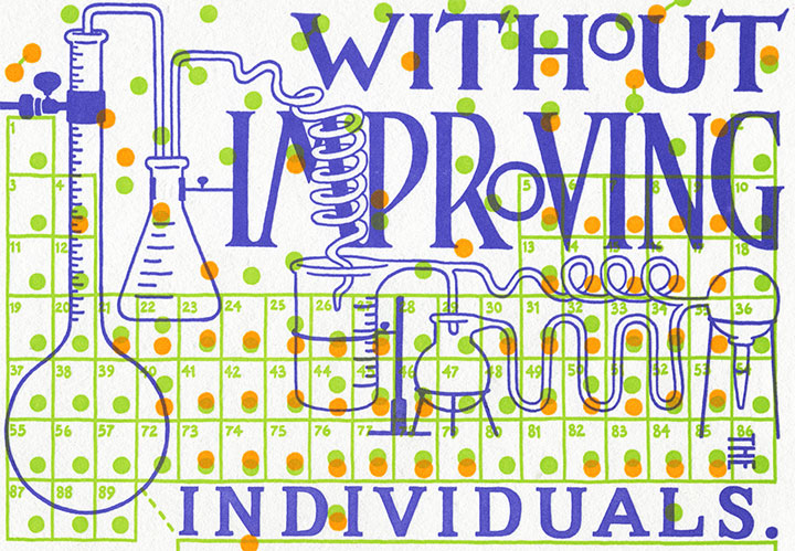
"The Curie Cure" letterpress broadside by Chandler O'Leary and Jessica Spring

I guess it was inevitable that Jessica and I would veer back into controversial territory eventually—we’re a little ornery, after all (as if you hadn’t guessed). We’ve been sitting on this concept for several months now, and have put it off a couple of times in order to move Thea Foss and Harriet Tubman ahead in the queue. Now, though, the time feels right—or maybe we’re just so upset and keyed up by the issue at hand that we just couldn’t wait any longer. Either way, we’d like to offer our take on what a famous scientist might have had to say about health care:

You cannot hope to build a better world without improving the individuals. —Marie Curie

I’ll spare you the ranting and raving that you can find in countless other pockets of the internet (or my house), except for one small, very personal anecdote about this topic. You see, I am self-employed, as a working artist and bona-fide small business owner. And it’s a mighty good thing that I happen to be married to someone with a full-time employer, because when I traded my graphic design day job to go full-time with my business, I also gave up access to health insurance that was anywhere near affordable. So I am currently on my husband’s health insurance, which costs us—wait for it—approximately $650 a month. That’s just to cover me, and I don’t have any “preexisting conditions” (why is it that I always want to say “preconceived notions?”) or other health problems. Since we absolutely refuse to be among the millions of uninsured, remaining able to pay for coverage is our top priority. Except that’s about to get a lot harder, because this coverage—which is provided by one of the two American “non-profit” insurance co-ops, by the way (remember the buzz about those?)—will be increasing by twenty percent come January. I don’t say this to garner attention or sympathy or to ask for advice—merely to illustrate my first-hand experience of the unsustainability of the system. I won’t prolong this post by weighing in on my personal preferences for health care reform, but something, somehow, has to change.

Detail of "The Curie Cure" letterpress broadside by Chandler O'Leary and Jessica Spring

Here’s where Marie Curie comes in. Despite being snubbed and rejected by her peers again and again, Curie devoted her life’s work (and ultimately her own health) to finding answers. And what she found not only changed our understanding of science forever, but also laid the foundation for many of the medical treatments we take for granted today.

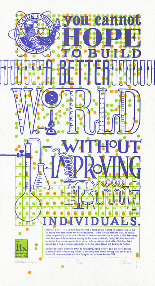
In tribute to her tireless efforts, The Curie Cure is a miasma of small details that slide in and out of focus as they compose the “bigger picture.” Each individual atom, printed in fluorescent ink, battles the text for attention—in vivid, radioactive color. The edition size is a nod to Curie’s discovery of new elements (the half life of polonium is 138 days), while the connected scientific equipment illustrates the trickle-down effect of any political action. Above all, the dominating pattern of molecule diagrams serves as a reminder that we’re all in this together.

Detail of "The Curie Cure" letterpress broadside by Chandler O'Leary and Jessica Spring

• • • • • • • • • • • • • • • • • • • • • • • • • • • • • • • • • • • • • • • • • • • • • • • • • • • • • • • •

The Curie Cure: No. 6 in the Dead Feminists series
Edition size: 138
Poster size: 10 x 18 inches

Printed on an antique Vandercook Universal One press, each piece is printed on archival, 100% rag, recycled paper, and signed by both artists.

Colophon reads:
Marie Curie (1867–1934) was born Maria Sklodowska in Poland. She left to attend the Sorbonne where she met her husband Pierre Curie. Together they studied radioactivity — a term coined by Marie, who focused on isolating radium and polonium (named in honor of Poland). The Curies won the Nobel Prize for physics in 1903. After Pierre’s death, Marie won a Nobel in chemistry, becoming the first person awarded twice. During WWI, Marie, worked with her daughter Irene to train nurses in the use of xrays to locate bullets in injured soldiers. Marie later died of leukemia due to years of radiation exposure. She was the first woman honored with burial in the Pantheon.

Illustrated by Chandler O’Leary and printed by Jessica Spring, inspired by Curie’s belief that “now is the time to understand more, so that we may fear less” as our country moves towards providing health care for all its citizens. 138 copies were printed by hand at Springtide Press in Tacoma. November 2009.

UPDATE: poster is sold out. Reproduction postcards available in the shop!
Detail of "The Curie Cure" letterpress broadside by Chandler O'Leary and Jessica Spring

Behind the scenes, part one

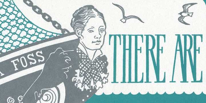
Detail of "Tugboat Thea" letterpress broadside by Chandler O'Leary and Jessica Spring

Holy cannoli, everyone! I’ve only just now come up for air—I’ve been buried under invoices, subscription forms, kraft mailers, and email print-outs, and Thea’s face is repeated all around me as reserved copies are spread all over the studio. Since I posted her here on Tuesday night the orders have just poured in, and over three-quarters of the edition is spoken for already. And Prop Cake is disappearing fast, too; we’re down to our last handful. Wow—just…wow. Thank you all so, so much.

Since Jessica and I talked about our process at the Tacoma Art Museum the other day, we thought it made sense to share that process with you, as well. But since there’s rather a lot to say on the subject, I’ve decided to break it into two posts.

• • • • • • • • • • • • • • • • • • • • • • • • • • • • • • • • • • • • • • • • • • • • • • • • • • • • • • • •

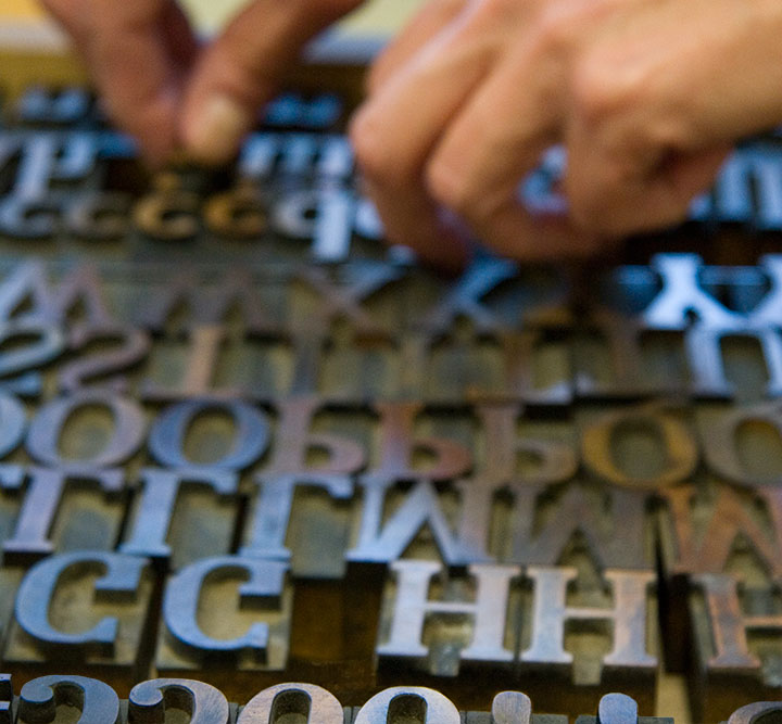
Before I get into the technical details behind our series, I should probably share a little background information on letterpress and the art of the broadside. For those of you who aren’t familiar with the process, letterpress printing refers to a type of relief printing, where pressure is applied to a piece of paper placed over a raised form that is covered with a thin layer of ink. This pressure transfers the inked image onto the paper, and can be repeated to create a batch, or edition, of prints. The form can be a carved block of wood or linoleum; a raised plate made of magnesium, photopolymer (plastic) or other materials; or as the term letterpress implies, movable type made from metal or wood.

chandler_oleary_studio_2652

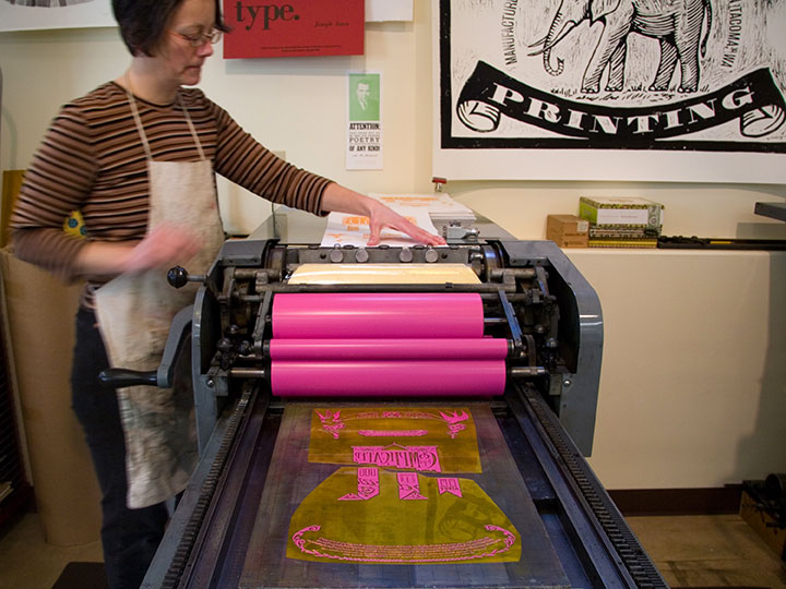
The innovation of printing words from individual letter blocks that can be rearranged and reused was actually invented by the ancient Chinese (seriously, what wasn’t originally invented in China? We owe those folks a whole heap), but the process that evolved into modern letterpress was most famously perfected over 500 years ago by Johann Gutenberg, of Gutenberg Bible fame. By the first half of the twentieth century, when more modern commercial printing came along, it was still common for printers to perfect their layouts using movable type and relief-cut images on a proof press (such as Jessica’s Vandercook below). They’d then use the resulting print to make more sophisticated plates for their more efficient and advanced commercial presses.

Process photo of "Prop Cake" letterpress broadside by Chandler O'Leary and Jessica Spring

As commercial printing became more streamlined, the cylinder and platen proof presses (see photo of Jessica printing above) fell out of vogue, and eventually were no longer manufactured. Artists quickly saw their potential, however, and have adopted letterpress printing as an art form—using, refurbishing and maintaining this antique equipment to create original works of art.

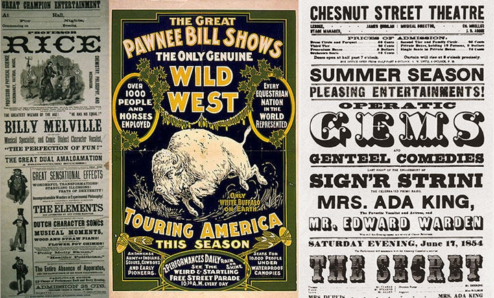
Vintage broadsides

Hand-in-hand with letterpress printing, the art of the broadside has also survived and evolved into a modern format. The term broadside means any single sheet used to convey information, often of a political kind—the great-grandpappy of the modern poster. While today the words broadside and poster are sometimes used interchangeably, the broadside has remained a favorite of the letterpress community because of its emphasis on typography and content (hey, we need an excuse to use all that gorgeous metal type!).

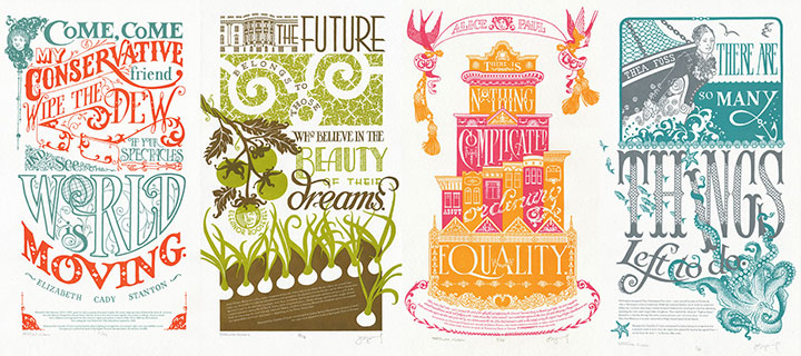
Dead Feminist broadsides by Chandler O'Leary and Jessica Spring

Jessica and I had this history in mind when we began the Dead Feminists series. As I said before, we never dreamed of starting down the path we’re on now; we just wanted to make a political and artistic contribution to the election. And to pay homage to the history of the broadside and the era in which each of our feminists lived, I designed each piece with historic broadsides and posters in mind. And to keep the series consistent, Jessica and I came up with a few rules of engagement:

1. Each poster has to feature a quote by a feminist. It doesn’t necessarily have to be a woman, but there are already plenty of posters highlighting the words of dudes, so we figured that one was covered already.

2. Said feminist must be deceased. (Hence the name.) You’d be surprised how many challenges that’s created for us.

3. Each quote is tied into a current sociopolitical issue or event. This is usually Jessica’s job, as she’s got a particular knack for finding relevant quotes.

4. The whole piece (except the colophon at the bottom, of course) is hand-drawn.

5. We try to stay away from well-worn tropes like “women can do anything men can do!” in favor of broader topics and concepts.

Who knows how long people will be interested in these things, or how many broadsides there’ll be in the series—all we can say is that we’re grateful for the response people have had, and we’re having way too much fun to quit now. The fun of art-making and the joy of the public response aside, the best part of creating this series has been exploring the lives and work of so many inspirational people. “Feminism” has become somewhat of a dirty word these days—mostly because of misconceptions. To us it’s a positive thing, and creating this series is our way of celebrating those who championed far more than just gender equality. Besides, we’d like to make our own contribution to our social history—and using the “power of the press” in the literal sense is the best way we know how.

• • • • • • • • • • • • • • • • • • • • • • • • • • • • • • • • • • • • • • • • • • • • • • • • • • • • • • • •

Coming in part two: the nitty gritty details behind our process.


Prop Cake

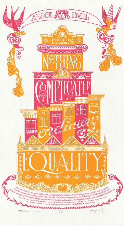
"Prop Cake" letterpress broadside by Chandler O'Leary and Jessica Spring

Jessica Spring and I have been having a high ol’ time with our series thus far, celebrating positive changes happening around the country with the first two prints we created. At the same time, we were shocked and dismayed to learn that in the recent election, Proposition 8 had passed in California. We wanted to express our thoughts on the matter, so Prop Cake was born. The quote we chose made the issue seem like…well, a piece of cake:

There is nothing complicated about ordinary equality.  —Alice Paul

The initial idea for this piece came almost immediately; Jessica looked over at me on a drive home from Seattle one day and said, “How about a big, pink wedding cake?” I grinned from ear to ear, and started sketching as soon as I got home. The design didn’t come together so easily, however. Everything I came up with looked more like an ad for Modern Bride than a political poster. Frustrated, I pushed my sketches aside and took a few days off to think.

And then I went to San Francisco.

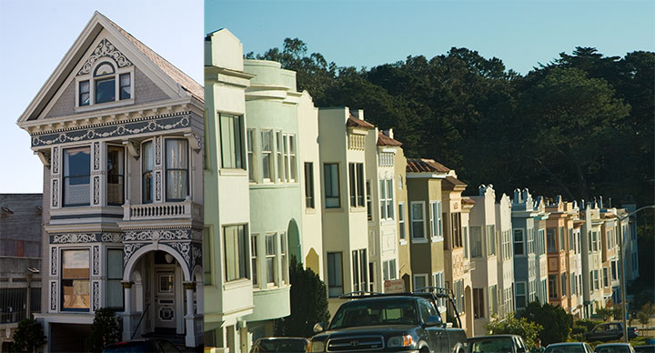
San Francisco photos by Chandler O'Leary

It was my first trip there, and my first thought as I passed through the residential neighborhoods, with rows and rows of candy-colored stucco houses, was “Wow, these things look like big frosted cakes!” And the lightbulb turned on, at last. I spent three days walking, driving, and riding around the neighborhoods, camera and sketchbook in hand. I made pages and pages of notes on architectural detailing.

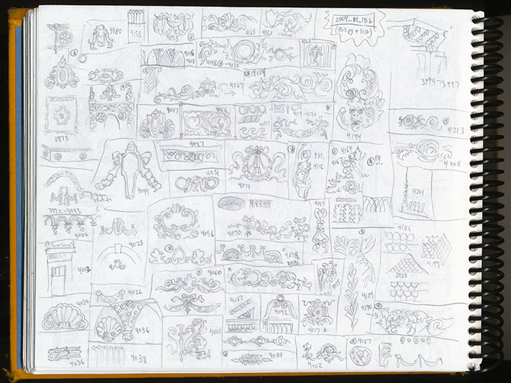
"Prop Cake" process sketches by Chandler O'Leary

When I arrived home, I got right to work. This time, finally, it all came together.

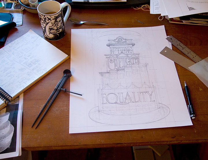
"Prop Cake" hand-lettered process drawing by Chandler O'Leary

Alice was right—it really was a piece of cake.

• • • • • • • • • • • • • • • • • • • • • • • • • • • • • • • • • • • • • • • • • • • • • • • • • • • • • • • •

Prop Cake: No. 3 in the Dead Feminists series
Edition size: 108
Poster size: 10 x 18 inches

Printed on an antique Vandercook Universal One press, on archival, 100% rag (cotton) paper. Each piece is numbered and signed by both artists.

Colophon reads:
Alice Stokes Paul (1885 – 1977) continued the work of the suffragists, and helped form the National Woman’s Party to demand equal rights. The NWP engaged in militant demonstrations and the first picketing of the White House; these “Silent Sentinels” were mobbed and imprisoned, then force-fed while attempting a hunger strike. Public and media support for their cause grew and by 1920, women secured the vote. Alice Paul continued to work on their behalf, writing the original Equal Rights Amendment in 1923.

UPDATE: poster is sold out. Reproduction postcards available in the shop!

Victory Garden

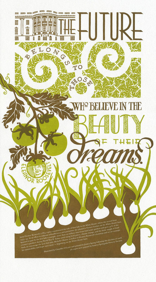
"Victory Garden" letterpress broadside by Chandler O'Leary and Jessica Spring

With the success of our first piece, Jessica and I wanted to continue our series with something that upped the ante a bit. And to our complete shock, we were rewarded by our second broadside selling out in just 48 hours (thanks to the magic of the internets!). Our next subject is one that we both have been thinking about for some time: personal sustainability. As my husband and I are both hard-core seasonal foodies, and as Jessica is a member of a local crop share, we’d like to see a change in the American food system. So we turned to one of our favorite feminists: Eleanor Roosevelt.

The future belongs to those who believe in the beauty of their dreams.

While serving as First Lady, Roosevelt planted a White House victory garden during World War II; thanks to her inspiration and example, during the War home gardens accounted for 40% of the U.S. supply of vegetable produce. We thought, hey, if it could be done once, why not again? So the colophon at the bottom included a plea for the new First Lady, Michelle Obama, to carry on in Roosevelt’s footsteps.

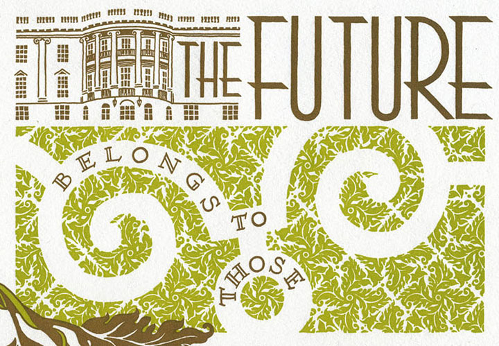
Detail of "Victory Garden" letterpress broadside by Chandler O'Leary and Jessica Spring

The inspiration for Victory Garden came from a variety of sources. For one thing, the typography is inspired by the Art Deco designs of Roosevelt’s era. For another, I thought back to my honeymoon in France last year.

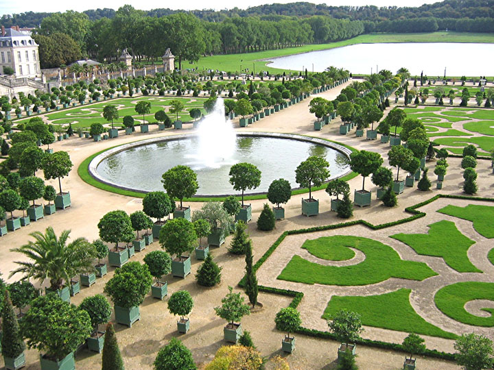
The orangerie at Versailles

I spent a day at Versailles on that trip, and at the time was struck by the meticulous aesthetic that unified every element of the place. Everything from the wallpaper to the upholstery to the grounds themselves worked together to form a cohesive overall design. An overly ornate and despicably ostentatious design, sure (and a bit ironic, considering Marie Antoinette’s consequences for going overboard with luxury in the face of a starving populace), but it was beautiful in its own right. I especially loved the sculpted hedges and lawns of the Versailles gardens; the patterns form a stunning, living brocade at one’s feet. And I wanted to turn that design sense into something that represented the greater good, rather than the wealth of the few. So I abstracted that idea into a two-dimensional White House lawn, made up with an original brocade pattern of spiraling leaves.

When we finally arrived at the finished product, we were happily surprised to learn that many others had had similar thoughts. We discovered Michael Pollan’s editorials; learned about the “Eat the View” movement; and found many other like-minded folk along the way—including one who purchased a copy of Victory Garden for her friend, a direct descendant of Eleanor Roosevelt herself. As the icing on the cake, one of our Chicago customers has a personal connection to the Obamas, and promised to deliver a copy of the broadside to the First Lady, with our compliments. We have no idea if it actually reached her in the end, but there’s always hope. And besides, we’re taking a bit of personal pride in being part of a larger movement, as well as the fact that the new White House garden is already happening.

Victory garden, indeed.

• • • • • • • • • • • • • • • • • • • • • • • • • • • • • • • • • • • • • • • • • • • • • • • • • • • • • • • •

Victory Garden: No. 2 in the Dead Feminists series
Edition size: 76
Poster size: 10 x 18 inches

Printed on an antique Vandercook Universal One press, on archival, 100% rag (cotton) paper. Each piece is numbered and signed by both artists.

Colophon reads:
Anna Eleanor Roosevelt (1884 – 1962) transformed the role of first lady in the White House, where she served from 1933-1945. In an effort to cultivate self-sufficiency and patriotism, she planted a Victory Garden on the White House lawn. Spurred in part by the first lady’s example, more than 20 million Americans had home gardens and grew 40% of the country’s produce during World War II. Today, amid rising food prices, climate change, and the finite supply of fossil fuels, we encourage the next first lady, Michelle Obama, to follow in Eleanor Roosevelt’s footsteps and set an example for sustainability and hope once more—beginning on the White House lawn.

Poster is sold out. Reproduction postcards available in the shop!